Business Card Mockups for Every Industry: What Works for Law Firms vs. Creative Agencies vs. Startups
There’s a moment every designer knows — the card is finished, the typography is locked, the color palette is perfect. But how does it actually feel in someone’s hand? That’s where the business card mockup earns its place. It’s not just a presentation trick. It’s a storytelling tool, a confidence builder, and often the deciding factor between a client saying yes or asking you to start over.
Most people get this wrong: they treat mockups as interchangeable. A sleek, shadow-heavy mockup that looks stunning for a law firm can feel cold and clinical when presenting a branding concept for a startup. Industry context matters — and understanding it changes everything.
Why Industry Context Changes Everything
Different industries carry radically different visual languages. A law firm’s identity lives in restraint and authority. Creative agencies breathe through color, asymmetry, and personality. Startups need agility — bold but approachable, innovative but human. Presenting any design in the wrong mockup environment is like playing jazz in a courthouse: technically possible, profoundly confusing.
It’s about psychological fit. When your mockup environment mirrors the world your client inhabits, trust comes faster, revisions come fewer, and approvals come sooner.
Law Firms: The Art of Controlled Sophistication
Law firm branding demands mockups that whisper authority. Think marble surfaces, muted neutral tones, and crisp top-down angles that emphasize precision. Heavy shadows introduce ambiguity — clean, diffused lighting keeps things grounded.
The best legal mockups show a single card, centered, on a minimal surface. No clutter, no distraction. Just the card and its quiet confidence. Avoid casual lifestyle shots, warm wood grain textures, or anything that suggests informality. A law firm’s card is not relaxed. It’s intentional.
Creative Agencies: When the Mockup Is Part of the Art
Here, the rules flip. Creative agencies expect the mockup itself to be a design statement — multiple cards fanned out, overlapping compositions, bold backgrounds that clash beautifully with the card design. These signal that the presenter understands visual risk.
Isometric views, close-ups of texture, scattered layouts — they communicate that design lives in every detail. Consider mockups that include supporting brand elements: a matching envelope, a folded sheet, a wax seal. Creative clients are presenting entire identity systems, and a scene tells a richer story than a lone card on white.
Startups: Energy Meets Approachability
Startups want to look established enough to trust and innovative enough to excite. Flat lay mockups work well here — top-down shots with minimal props like a phone or a plant suggest a real workspace without over-styling. Color flexibility matters too. Many startups iterate fast, and mockups that allow easy color swapping are practical gold during early brand presentations.
Real Examples: How Designers Use Mockups in Practice
- Brand studios use them in pitch decks to show the full identity rollout before printing a single card — saving clients thousands in production revisions.
- Freelance designers include mockups in proposals to justify premium pricing. A realistic presentation signals professional-grade work before the invoice is opened.
- Marketing teams use them in case studies and social content, showcasing brand work in a way plain screenshots can’t match.
- Startups use mockups in investor decks to show brand readiness, so the pitch can focus on the business model.
What unites these cases: the ability to show something real that doesn’t yet physically exist.
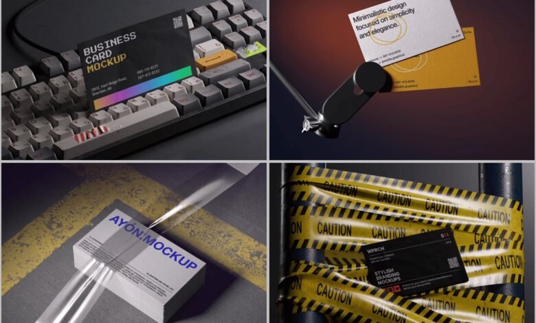
Premium Mockups on ls.graphics
When it comes to quality that designers actually notice, ls.graphics stands apart. Their mockup collection reflects a level of craft that’s hard to forget once you’ve worked with it.
The rendering is the first thing that catches your eye — every shadow, reflection, and surface texture feels genuinely photographic. Paper grain, edge reflections, soft ambient light: the realism holds up at full zoom.
The files are organized like a professional’s toolkit — layers clearly labeled, logically grouped. No hunting through stacks to find a smart object. Editing is fast and satisfying.
Angle variety is exceptional: top-down, side, isometric, scattered, stacked, fanned. One pack covers presentations for law firms and creative agencies alike. Multiple color styles — light, dark, neutral — are included out of the box, so the same card can feel warm in one presentation and razor-sharp in the next.
Compositions follow a stylish minimalist philosophy that never dates. Drop in a smart object, adjust if needed, export. No learning curve. Just results.
Conclusion
The best business card mockup isn’t the most elaborate — it’s the one that makes your design feel right for the world it’s entering. Law firms want gravity. Agencies want spark. Startups want credible energy.
Mockup choice is a communication decision. Get it right, and clients respond faster. For designers building a serious mockup library, ls.graphics delivers the rendering quality, versatility, and ease that professional workflows actually demand.
Put the right card in the right world.